Here are the images for my magazine: cover, contents page, and double page spread
Front cover
.png)
Contents
%20copy.png)
Double page spread
%20copy%202.png)
%20copy.png)
Here is the link to my digitalised magazine: final magazine
Here are the images for my magazine: cover, contents page, and double page spread
Front cover
Contents
Double page spread
Here is the link to my digitalised magazine: final magazine
Here is my critical self reflection for my magazine project
critical self reflection media magazine by raraa


%20copy%202.png)
%20copy.png)
Here is the development and detailed research of my contents page for my magazine
Reflection: If I had to be honest this was actually the easiest part when I was making my magazine I was able to come up with a final draft within the first lesson of working on it which was 2 hours. All I had to do left was fixing the minor details with my teacher in order for it to look very nice. As I enjoyed experimenting with different layouts and designs and finding out which typefaces work well on this page, however I hated compiling the research and needing to remember to screenshot each time I wanted to make a change within the page as sometimes when I get into the zone and enjoy putting everything together I keep forgetting to screenshot from time to time.
Problem: Although I had a problem in finding inspiration from different magazines as most didn't suit my taste due to it looking very vintage and not matching up with the style of magazine Im going for
Solution: So instead I made most from random ideas I had in mind or not I look at real magazines some of my classmates brought as most were more modern looking and I took most inspiration from that
I will start off with the research I have on some fashion contents page that caters to my target audience (young adults)

I also referenced some from my old research that I first done about magazines, however I will pick a few to draw out drafts for it and here are some that I recreated from my research and some from my own creativity
Step 1: sketches (red text indicates the type of shot taken)


As I already figured out to use this layout I just tried experimenting with other elements which was the typeface of the heading. One example would be this

I tried by covering some part of my picture with the heading but I didn't end up using this design as it looked messy
Step 4: Final contents page

This is my development for my front cover magazine
Reflection: I believe this was the most time consuming task I ever spent in this whole project even though the end result looked very simple it was quite hard and hard to compile everything in order for it to look cohesive. Even though I enjoyed playing around with different typefaces, elements, and positioning this took such a long time to the point where I took up 2 full class lessons just to fully finish it to my liking and being able to get approval from both my teacher and classmate.
Problem: The hardest part for me was finding a colour scheme that could match every single element present. I tried using the typical pinks, blues, yellows but it always turns out too be too soft or too bright
Solution: I decided to just use colours that were already in my image and that worked out to be the best option, even though I had to make my own colour palette using those from the image is so much easier all thats left is to darken or lighten the colour to our liking.
Starting off with my research I have collected for my front cover this is all that peaked my interest or what I think are good front covers but there are still parts i disliked and tried to avoid. We can see that most front covers uses direct mode of address and they all have a colour scheme that ties everything together, all mastheads have a similar typeface even though its for different brands which is why the typical convention for a fashion magazines are that all typefaces are stylish or even blend in with the background so not all elements of the magazine should be recognisable right away, at least theres a difference in how the main cover line is decided in order for that one part to stand out more than the other cover lines. But again each colour theme for every magazine will be different depending on the season of its production, normally it would use white for the masthead but again it can be different depending on the season. We can also see that most uses left or right aligned for the texts of the magazine but it can be different at times which we can also see from magazine that uses the justified text.


Step 1: Started of with 2 digitalised drafts with pictures I took during lesson time as I still didn't have my final pictures that I will use for my final magazine

Step 2: This is when I started to make my front cover drafts with my own image
1. First draft where I decided on all the typefaces and how i want each to be placed on the front cover

2. But again I experimented with different colours for the front cover as it looked too soft in the first draft, this is when I decided to try a darker colour for my cover line

3. Then i tried a darker colour for my masthead


5. Then I decided to receive advice from my teacher with all the different colour combinations that I came up with and this was the one of the final drafts


7. But I still decided to stick with this colour palette as I will follow the typical convention where most texts in fashion magazines follow a stylish typeface and the colours all really blend in together making it harder to read at first this is shown through fashion magazines of HARPERS BAZAAR and VOGUE.

8. I started to finalise my front cover page and this was the final result, I received feedback to change "top 10 anileve best looks" to "top 10 anileve looks". I also changed my masthead in order for it to be more spaced out allowing it t fit the border I made and then I made the texts for my cover lines to be a bit smaller as I wanted to follow the typical convention of having smaller texts on the front cover. I also decided to also make this a november edition magazine as I used warm autumn colours such as browns and reds for the front cover.

Step 4: finalised magazine cover
Not much has changed on my final cover as I already had it revised with my teacher before, but all I added now was the year my magazine will be published as before I only added the month.

In this post I will demonstrate some basic design skills that i learned in class
Reflection: This task was actually quite simple and enjoyable but I do prefer doing it digitally then on sketch as its not easy for me to come up with ideas within 5-10 minutes. Even though this made me have to brainstorm ideas quickly I was able to go out off my comfort zone and try styles I never thought would look good which is why most of these drafts aren't very detailed but at least I got my main ideas down which was the placement of masthead, cover line, main cover line, barcode, and image. Most of these drafts weren't connected with my research as again it was very time limited so I just tried making it in any way for it to be similar to my genre as most were came from the top of my head. This also made me try different interesting shots such as long shots or very close up shots as most aren't that common.
Problem: I actually forgot to save a lot of my drafts which was why I had to re do some and screenshot it again since I was mainly focusing on the placement of all the elements.
Solution: I keep remembering myself to take screenshots even for slight changes which is why is why now I have many screenshots for all the minor and major details I took.
Task 1: sketching
I started by sketching my possible front cover designs and it actually took me a long time as I am very indecisive and just kept on drawing-erasing back and forth. But I discovered that in this stage my drawings don't have to be detailed just drawn well enough that my idea shines through.


Here is an additional post where I add all the pictures I took and some bts pictures as well

I took many pictures but I ended up finalising them to only 25 pictures where I edited most of them

link to my google drive: edited magazine pictures
Here are some pictures of potential locations for my magazine
Reflection: This was actually one of those tasks I hate as I couldn't come up with any risks that were life threatening or hard to control as all variables that could cause an accident can be easily fixed by being careful. Which is why I repeated some points for different locations as its all in one location (my house) but just different parts of my house hence why its harder for me to figure out what could go really wrong. But even though this was a very boring task at least it helped my manage my time to make sure I have everything prepared beforehand.
Location #1


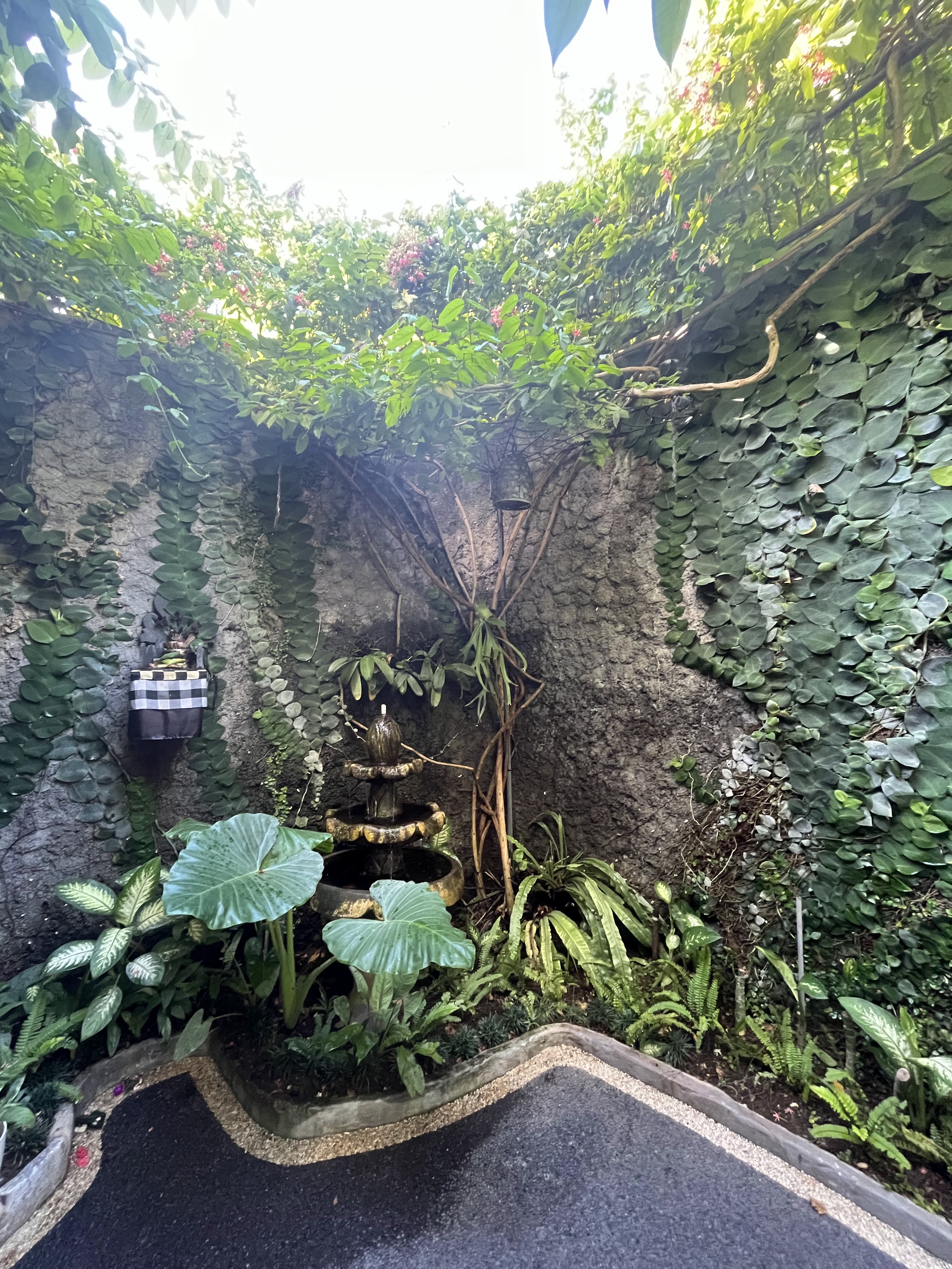


My house (outdoor garden) | |
Purpose of the scene: | introduce the scenery (garden) to show how natural it is to the audience: showing a magical front cover |
Media Language: | mise en scene: flowy (blue) princess dress in order for the magazine to look magical, with warm/bright colored background medium shot: to show the models facial expression with direct mode of address but its enough to the point where you can see how beautiful the dress is |
Pros of Location: | - flexible as its my own house and I can use any props available as well as adjust any natural scenery - realistic, since i'm using a real outdoor background it will look more natural and cohesive |
Cons of Location | - hard to control how bright or dark i want the light to be as it will be different in different times of the day - may not look very neat as not everything outdoor is as clean if it were to be done in a studio |
RISK ASSESSMENT | |
Potential Hazards | - My dog since she's not used to new people - Equipment issues as the garden is not very spacious and it can cause casualties if one gets hit or dropped - Hanging plants in the outdoor garden |
Evaluate Risks | - She can bark and go around the person she is not familiar with in this case its the model - Broken equipment can cause a delay and even cancel the entire shoot as there might not always be a backup on hand - If a tragedy happens due to unfavourable weather conditions (strong winds) it can cause the plant to fall and injure the model |
Control Measures | - Put my dog in another room in order for her to not disrupt the shoot - Make sure to handle all the equipment properly by having each checked and only used when its time to shoot and take pictures if not it will be properly placed somewhere else and regularly checked - check the weather before hand and check everything beforehand and see if it will still be used or needs to be removed |
Assign Responsibility and Timeframe | - Put my dog in a different room (28 jan) - Packing and keeping the camera safe (27 jan) - Check wether forecasts on weather (27 jan) |
Another garden near the outside gate (outdoor) | |
Purpose of the scene: | showcases the scenery of flowers of plants with the model to give it a natural look |
Media Language: | mise en scene: simple blue dress with flowers to match with the soft theme in order for it to flow with the already chaotic background filled with flowers medium shot: to show the face but as well as the body of the model in a professional look |
Pros of Location: | - natural setting gives a more realistic look and vibe - Has colorful aspects such as the flowers - Easier to manage everything around the garden as I can move it as much as I like |
Cons of Location | - Harder to control the lighting of the area if i want it to look brighter or warmer - Some parts look dirty on camera as its an outdoor setting and there will be dirt in some areas |
RISK ASSESSMENT | |
Potential Hazards | - Can be slippery from watering all the plants which can cause the model to fall - Feel discomfort from insects that may be around the location |
Evaluate Risks | - Making sure to water the plants before or not after the shoot to stop the floor from getting wet - The model getting uncomfortable causing them to be in a mood due to discomfort of their surroundings |
Control Measures | - Making sure to water the plants before or not after the shoot to stop the floor from getting wet - Prepare a insect spray and not taking that long to shoot outside just incase it uncomfortable for the model |
Assign Responsibility and Timeframe | - Packing and keeping the camera safe (27 jan) - Making sure everything is clean and not slippery (28 jan) |
My staircase (indoor) | |
Purpose of the scene: | mostly shows the model and introduce the clothes she's wearing as the main piece of the picture |
Media Language: | mise en scene: an iconic top piece which will mostly tie in the entire colour pallete for the whole magazine. I mostly envision a soft pastel piece in order to give my magazine a softer yet ethereal look medium shot: to show the face but as well as the body of the model in order to show the direct mode of address and as well as the models body language so that it looks professional |
Pros of Location: | - fully white background so its easier to control how bright I want the lighting to be - flexible as again its my house and I can adjust anything if something gets in the way |
Cons of Location | - not fully clean as the wall have some dark spots which makes it not that put together but thats a problem I could solve by editing it - does not look like a real studio even though it gives off an illusion that it was done in a studio because of the white background there are many things I cant control from how |
RISK ASSESSMENT | |
Potential Hazards | - Equipment issues if I drop the camera on accident and it rolled down the stairs causing it to break - The model can trip and fall on her dress if not careful which can cause an injury |
Evaluate Risks | - Broken equipment can cause a delay and even cancel the entire shoot as there might not always be a backup on hand - The model getting injured can also cause a delay and cancelation as there will be no replacement |
Control Measures | - Make sure to handle all the equipment properly by having each checked and only used when its time to shoot - Help the model every time she needs help coming down the stairs such as holding her dress |
Assign Responsibility and Timeframe | - Packing and keeping the camera safe (27 jan) - Prepare insect repellent (27 jan) |
This blog consists of my groups final music video, digipak, and social media page. This blog is written by me (Rara) Music Video MV Gdrive ...
