Here is my research for the magazine project
Reflection: This was another one of those harder tasks to accomplish as it took extremely long and required a lot of analysing, which made me quite lazy to accomplish it all as again it was a lot. Although I found that learning new terms became easier since I was using it repeatedly which allowed me to memorise most terms overtime and the task became much more entertaining even though I did it quite quickly. So in the end of this task I memorised most of the new terminologies including understanding more on targeting a magazines audience with specific details, and how connotations are used in the media industry. This research will also help my final project since I can pick and choose the bits and pieces I like and dislike in order I know what to avoid or add in my final magazine cover.
Indonesia Tatler (July 2018)
Asia Tatler (Tatler)
Tatler is a luxury media brand that celebrates the best of Asia. Their magazines also have a strong visual identity with diverse and impactful feature stories reflecting the passion and interests of Asia's most influential


Overall, this magazine cover is very simple yet sophisticated as the usage of the fonts and colour really help build a expensive taste for the audience their trying to capture. I personally love the font used in the masthead but not so much for the main coverline as its too thin with a dark brown background that made it hard to easily recognize. However, the colours used in this magazine didn't really entice me that much since, all the celebrities used the same coloured clothing except for one but it then makes the entire magazine look very dull and dark. I also didn't like how the magazine used many celebrities in one cover as it makes everyone present not as special thus making it hard for the consumer to know whats special about the magazine and how it differentiates itself from other magazines.
Media language
The typical conventions of a fashion magazine includes a big image of a celebrity or icon that best suits a magazines brand image or what the contents would mostly be based out of or what attracts a certain customer base from having the icon on the front cover. The vogue Australia followed the convention by using Lily Collins as the main image to attract the target audience. Furthermore, the colour green was most likely the main colour theme of the whole magazine in general as the big large elegant font was also a different shade of green, this then also helps allow the brand name to easily stand out from the rest of the information given in the front cover. But, then again the main coverline was also made to stand out from the rest of the coverlines as it was given a bigger font than the rest by highlighting "the rebirth of style" it gives more insight to what the contents of the magazine will actually be and what adverts or products/celebrities to be expected within the magazine.
Representation
The women on the front cover which is Lily Collins has been represented in a positive light. We can see from the pose and how her hairs been styled that the celebrity looks very stunning and almost perfect due to her clean appearance. But it also still engages with the audience due to her hair being a bit messy it gives the celebrity a natural look making it more relatable to the targeted market yet it also uses direct mode of address with the celebrity looking directly on the camera. First of all, the colours used for Lilly Collins outfit was different shades of green which represents freshness allowing the magazine to please the eyes of the audience. Thus, using simplistic jewellery can allow the celebrity to look more put together and less flashy giving the elegance to still shine through as it can be seen that Lily Collins only has a pair of earrings and one bold statement ring.
Audience
The target audience for Australia's vogue magazine would be women from the ages 20-35 years old and those who are fashion lovers/enthusiast. From the uses & gratification theory by Bulmer & Katz, the main traget audience would read this magazine for surveillance. This is due to the audiences interests for fashion and the latest trend within the entertainment industry as the cover lines have different categories. The use of a thick and elegant font masthead allows the audience to be easily captivated to read through the contents and actually pick up the magazine as its from a high recognizable company and since its at the very top of the whole front page it will be the first thing the audience will see. However, regular audiences will already be familiarised with the same masthead being used allowing frequent readers to go back and easily notice the magazine.
Industry
Vogue is a famous magazine publisher all over the world and they regularly post about different magazines as well as videos and podcasts with different kinds of celebrities. Having these types of contents allow the audience to stay engaged with the brand itself as well as wanting to be up to date to whatever content vogue will publish. As this allows vogue to create media that their audience will consume and keep being interested in.
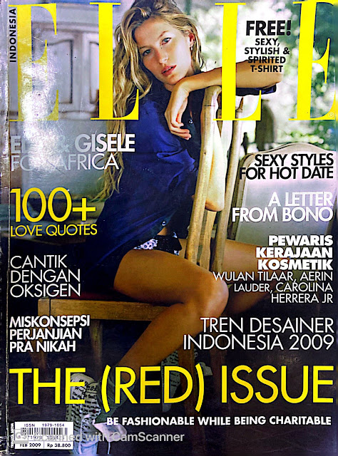

This is another fashion magazine and I really like the pose the model is doing in the main cover image as its very simple yet intriguing due to the use of a chair and its very sexy but it easily catches the eye of the audience. However, there are many things I will not follow from this magazine from the contents page and the many cover lines used on the front cover. In my opinion theres too much cover lines and the audience wont be able to know what to focus on when first seeing the front cover even if its gives more information towards the audience I believe it will be too much on the eyes making the whole front cover overwhelming. For the contents page i dislike the part where so much words were being used as the main point of a contents page is for the audience to be able to read everything quickly and just to know the main ideas of the whole magazine. The use of dark colours with the addition of yellow is not very professional and looks too incohesive together which makes the magazine look quite tacky especially since it from a popular brand.
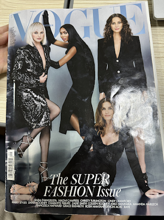
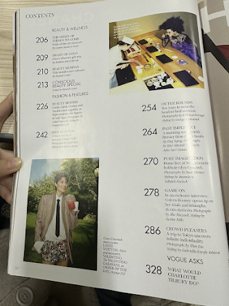
Overall I like how simple the contents page is however I believe its still too plain and lacking images and still too much words being used. But the front cover is very minimalistic as its only contains the images of the celebrities but with a short cover line at the very bottom, I will most likely follow the format of this front cover but with only one or two models as using four models looks to over crowded to be in one frame. Though, the colour black is very simple it doesn't give much life to a magazine making it seem boring, the colour blue on the masthead however is very clean and chic which fits with the background the models are in and again I will follow this type of font for the masthead as its still elegant and chic.
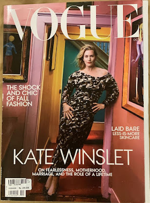
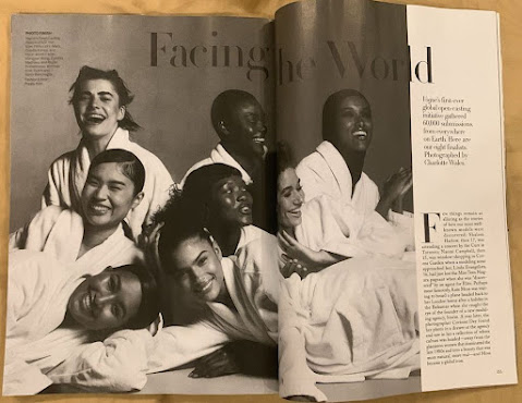
On this magazine I really love the double page spread as the image is filled with diverse models and they look very harmonized together making the magazine look very professional and neat. The use of black and white colours show that everyone is one not making one stand out more than the other but allowing all the models look good together. The font is also elegant which i will follow and the writings on the page is organized well making the audience know which to read first. The front cover is simplistic and minimalist however i dislike the use of the very colourful background as it draws too much attention to other things but the main celebrity itself. The cover lines are shot and straight forward which I might follow, though I will add a bit more cover lines in order for my magazine to look interesting.

I really love the double page spread of this magazine as its simple yet eye catching. The way the picture uses direct mode of address and how well focused it is as if the model herself is looking right at you, which is why the image is what I liked most about this page. However there's a lot of empty white space that I believed can be filled, but the font used throughout is very elegant and professional which is what Im leaning more towards to when I will make my magazine. In the double page spread I think there are too little text which makes it boring and not eye catching enough to read. Then again the front cover is very bright and really shows the model character as she looks fierce which indicates a lot about the contents of the whole magazine and what theme it will most likely follow. The cover lines are all very well placed in my opinion which makes the main cover line very prominent in this magazine, which is why I don't really like the background used as it looks very fake and not put together since it seems like its blurred not giving the luxury brand image vogue has.


No comments:
Post a Comment