Labels

Tuesday, 14 November 2023

Terminology

Here is the list of terminology that I have learned over the course of this project period 

Reflection: When my teacher first introduced us to magazine terminologies, I felt overwhelmed as It seemed like so much to memorise. But as the course of the project days pass the more I familiarised myself with the terminology given and by doing my own magazine research it exposed me to a lot more of these terminologies which allowed me to easily use the terminologies in actual questions. As the easiest for me to memorise was the Masthead and Main image due to it being very recognisable in a magazine. 

Terminology table given by my teacher: 

MastheadThe name of the magazine, in its typical font, on the cover.
Selling lineThe short description of the ‘identity’ of the magazine under the masthead,
Main imageThe image which fills the cover – a model, celebrity, animal, artefact.
Coverlines‘Teasers’ for the contents of the magazine on the cover.
Typography/fontThe shape, style, size and colour of the letters used.
Drop capThe enlarged initial letter of the first word of an article – an aesthetic feature which is designed to engage the reader.
Pull quotesEnlarged quotes from an article – these may be included in coverlines, but are also used in the body of the article to break up the page and to attract the attention of the reader.
BylineThe name of the writer of the article, usually found at the beginning. Simply, it is the ‘line’ which tells you who the article is by.
Main cover lineThe most important article featured, grabs the audience’s attention (featured article)
Mode of addressThe way the magazine/article addresses the audience. Formal, casual, direct (for images too)
BarcodeUsed for retailers
SkylineA list of keywords featured at the top of the cover
ThirdsThe upper and left third are the most important. why?
PropAn image of an item
Puff / BoxoutA smaller image/text to stand out from the rest of the information (puff=circle. boxout=square)
BuzzwordsExclusive, free, new, special edition
BannerA block of colour with info inside, usually stretches the width of the cover
CaptionInformation about an image.
SpreadPages of a magazine that should be viewed together (usually two)
BorderEmpty space around the edges
White spaceEmpty space in the spread, used to break up the content (negative space)

Thursday, 9 November 2023

Magazine articles: first draft

Here is my first draft for my magazine article 

Reflection: I actually rushed my article writing as I did it very close to the deadline which is why it made me work on my time management skills a bit more since it felt really tiring doing it near the submission date. Again it's one of those longer tasks to do as it was a 700 word article but the more I get into the zone and continue writing its almost as if I lost track of time since I kept writing my article until it exceeded 700 words. Once I completed my article I felt relieved yet happy that I put my thoughts and feeling into it even though I didn't check my grammar mistakes as much. This taught me to do my work beforehand even days before the deadline in order to achieve a result thats more than just good or relieve that its done, but happy that the result was excellent. 

Genre: fashion/lifestyle 

Topic: inner beauty 

Tone: informal as the target audience will be teens, most teens will most likely read something that is not so serious but is catchy by using catchphrases and relatable 

Direct/indirect: direct 

Who is the author: famous young new author age 19 - 22 (professional yet still relatable as its still someone young and just got famous due to teenagers popularizing her) 

Title: Enhancing your inner beauty 

Pullquote: Feeling beautiful is a reflection of self acceptance, self confidence, and positive self image. One step ahead F.H slips into the world of self love/acceptance each and every time. (her short podcast and interview) 

Article:


“Loving me, hard at times but I do and i will always do” she says while having her smile widen everytime. “I find that love and kindness can really take you an extra mile as it really did for me, everyday even when I do it once, in some way it brings out the best in me”. The love F.H has doesn't just help her but it can help anyone, appreciating yourself, loving yourself something simple that no one can truly accept fully. This all started from F.H standing on the runway as she gracefully walks into the room, it's evident that her beauty extends far beyond her flawless appearance. She gives off a warmth and authenticity that immediately captivates, inviting you to explore the depths of what true beauty entails. Once she stepped out of the runway reporters surrounded her and asked her questions, her one answer made social media go wild. "When we talk about beauty, it's not just about what you see in the mirror," F.H shares. "True beauty comes from within, it's a reflection of your character, your values, and how you treat others. It's about being kind, authentic, and embracing your uniqueness.

In a career that spans decades and has seen F.H in the limelight, the pressure to conform to society standards of beauty kept increasing. However, she reveals that her journey to enhancing her inner beauty has been a deliberate and mindful one. As it did not start with a simple psychologist or accepting her just like that from zero as she never was someone that was significant in someone's life just like that. Back in School she said that no one really cared about her, no one called her pretty or even acknowledged that she was there so having the spotlight now is not as easy as people seem, especially within the entertainment industry. "The entertainment industry often places a heavy emphasis on physical appearance," she acknowledges. "But over the years, I've come to realise that real beauty goes beyond the surface. It's about being comfortable in your own skin and embracing the qualities that make you who you are." she stated in a recent podcast with Sparks podcasts. 

But, In a world where public figures are often criticised , easily called out for little mistakes, F.H opens up about dealing with criticism and the importance of staying true to oneself. "I've learned that you can't please everyone, and that's okay," she reflects. "The key is to stay true to who you are. Embrace your uniqueness, celebrate your strengths, and don't be afraid to show your weak points as you can learn from them. Then again another hot topic of how F.H can keep her private life away from paparazzi as maintaining a balance between public and private life is a challenge faced by many celebrities. "It's essential to have a strong sense of self, especially in the public eye," she says. "Balancing the demands of fame with maintaining a private life requires setting boundaries and staying true to your values. Inner beauty thrives when you're at peace with yourself, both on and off the stage." Meaningful connections with others contribute to a sense of fulfilment and inner beauty. Nurture positive relationships that uplift and support you.

Another important way for yourself to feel loved is by surrounding yourself with people who appreciate your inner qualities and encourage your personal growth. Enhancing your inner beauty is a lifelong journey, a continuous process of self-discovery and self-love. Creating positive habits, embracing yourself, practising kindness, and nourishing your mind and soul, you pave the way for a radiant inner beauty which allows you to shine not just from the outside but from within yourself. Gratitude is also a powerful force that can transform your perspective on life as F.H mentioned. Take time each day to reflect on the things you are grateful for. Gratitude builds a positive mindset, fostering your inner beauty by helping you appreciate the luxuries of life you have experienced. As it comes to a close, F.H quotes “Remember, true beauty is not a destination but a reflection of the love and acceptance you cultivate within yourself.” As you embark on this journey, may you discover the boundless beauty that resides within you, the you that loves herself.


Wednesday, 8 November 2023

Double page spread: research + development

This is my research and development on my double page spread analysis

Reflection: To be honest this was quite a unexciting task as it was so much information to find and took a lot of time, however I learned what i dislike and like from a double page spread and gave me ideas on what I personally want my double page to look like and what I envision the final result to be like. As this also helped me understand more media terminology even this far into the project 

Here is my first magazine which is from a magazine brand called Vogue  


Before reading 
Magazine: vogue 
Issue: September 2023 
Publisher: Conde Nast 
Genre: fashion 
Images: One picture of different models within one frame using a medium shot as you can only see half of the models body in the picture. 
Layout: Page numbers are small and are on the bottom right of the page. This magazine has a very minimalistic and basic style as the colours used were only black and white the image itself was also made to look black and white only. However the texts only covered the bottom right of the whole page leaving negative space in between the texts in order for readers to easily read the different texts better. Dropcaps were also used in this magazine which can be seen for the longer texts put inside the double page spread in order for it to look more aesthetic. 
First impression: The main image really caught my attention as one half of the image covered one page in the double page spread allowing me to be more intrigued to look at the other half of the whole spread. The use of a really bold yet elegant title yet having it in different pages allowed me to completely see the spread as a whole better and not texts that are hard to read as the text was only on the second page of the spread. 

After reading
Heading: Facing the world 

Subheading: Names of the models and vogues first ever global casting initiative and the top 8 are the models within the page 

Author: There is a photographer mentioned which is Charlotte Whales 

Article: Included a story of how the first famous models were discovered from Shalom Harlow, Naomi Campbell, and notably the most successful yet surprising find was Kate Moss. It included how Kate Moss was originally found to become a model and a year later a photographer named Corinne Day found her photo and decided where the fashion industry was headed as during the 1980's more glamorous women were popularly known but with Kate Moss it rapidly changed to more naturally beautiful looking models.

Mode of address: It does not use a direct mode of address as It talked about other people and the event happening which made Vogue use different lesser known models within its magazine. The writing style was also informal with slangs such as "glamazon" in order for the audience to understand the content of the article better. 

Pull Quote: A pull quote was mentioned which is "Vogues first ever global open casting initiative gathered 60.000 submissions from everywhere on earth. Here are our eight finalists. Photographed by Charlotte Whales" this makes the audience understand what the main point of the article is as well as why those specific models were used in the advert. This just makes the audience capture the main point of the double page spread faster. 

Audience: Young women adults seem to be the main target audience as the models used seemed relatively young and the use of a more diverse range of models means it's targeting an audience more globally not just a specific race. 

Impression: I found the article to be quite interesting as I really liked how its laid out with drop quotes and pull quotes added. Not only that the article itself made me intrigued to what else was in the magazine due to stories being used with the addition of slangs as well. However the colour scheme didn't really intrigue me as it was too plain and didn't really catch my eye. 

Inspiration: I will take inspiration from the image as it was the first thing that captivated me to see more and the layout I will most likely follow since I really like that it can be easily read so I will surely add these ideas to a part of my magazine. But I learned that I didn't really like a boring colour scheme in my magazine as it didn't really give life to the magazine it seemed bland and a bit too serious even though the article was fun and catchy. 

Here is my second magazine which is from a magazine brand called Vogue 


Before reading
Magazine: vogue 
Issue: August 2023 
Publisher: Conde Nast 
Genre: fashion 
Images: The picture included many models from medium shot and even long shot to show more of the models outfit, the pictures used was all from different times but compiled into one
Layout: Page numbers were small on the right bottom of the page, and it doesn't have that much negative space only in the space between the pullquote and the main text. Not much texts were used as the main focus of the page was the image of the model and clothes showcased so all the texts were positioned on the bottom quarter of the page. The magazine style was much more colourful yet still minimalistic as it still included a white background which allowed the images to pop out more. 
First impression: The small images of more known celebrities actually caught my attention more than the bigger images used as you can easily identify the images more since bigger images mainly focuses on the outfit which I didn't pay much attention too since the smaller images included more outfits than just one big image of a model showcasing an outfit. 

After reading
Heading: Trends  

Subheading: "For autumn pay close attention to the cortada rule, wearing espresso brown pieces below the waistline and creamy layers on top" 

Author: There is no byline nor photographer mentioned in the double page spread only the models used, the clothes being worn, and where they got other images such as "getty images" listed next to the text yet hard to read due to how its positioned

Article: Included trends that has been happening within the fashion industry such as "Makeup by Mario palette" for makeup, as well as Mary Kate and Ashley Olsen designers with Anthony Vaccarellos fashion pieces mentioned. This also talked about how to wear fashion pieces for autumn season since its not about what you wear only, therefore the cortada rule was mentioned "wearing espresso brown pieces below the waistline and creamy layers on top"

Mode of address: It does use a direct mode of address since it talked about the how you should wear fashion pieces for autumn yet rare overall since it's only been mentioned once or twice due to the popular events also being mentioned and described. The writing style was also quite informal as it uses words that are very descriptive such as "never looked or felt so good". 

Pull Quote: No pullquote was mentioned within this double page spread 

Audience: Older middle aged women seem to be the main target audience as the models used were also middle aged and most dressed quite formally since it mostly shows clothing which is suit. Making it seem to be for much more older audiences as suits are associated with women already working or for formal events. 

Impression: I found the article to be quite fascinating as I really liked how many images were being used within the double page spread and also how the images were being laid out and positioned. However I wasn't fond of how the texts were put on the very bottom of the page as it made it harder to read and wasn't as convenient. 

Inspiration: I will surely take inspiration from the images and how its laid out as it's the only thing that made me interested to look at the page in depth, the colours were also vibrant making the page have more life and look more realistic which I will definitely follow. But I learned that I didn't really like having a small heading as it becomes harder to find even if its positioned further away from the other texts, the positioning of the article itself I didn't really like as it made me look so close to the magazine and moving it to different positions just to understand what the article is about. 

Wednesday, 18 October 2023

Stuart Hall: representation theory


What a representation is?

How people, places, events and groups are portrayed and depicted from media as something only has meaning once it's represented in media. 

Meaning?

Hall has said that media doesn't reflect meaning, media creates meaning as he argued that the original subject have NO FIXED meaning unless media give meaning AFTER the occurence. 

What a stereotype is? 

A generalised belief or idea about a particular person place, events and groups and are often based on social, cultural, and racial characteristics 

Why are stereotypes used? 

Used as a result of lack of diversity in production 

What social groups are represented in media? 

religion, gender, age, race/ethnicity, social class, lgbt, disability 


Trailer: Dilan 1990 (January 25 2018)


Men have been stereotyped to be aggressive or have more power over women in all aspects of media, western media usually shows that high school boys are usually the cool ones using cars with their varsity sport jacket as boys that play sports signifies higher popularity. While Indonesian media also follows this stereotype but in this case boys in motorcycle gangs are seen to be cool but also dangerous and should not be associated with. 


Through this scene we can see boys throwing things in front of a school gate and everyone from their gang coming together to try and open the gate violently 

Saturday, 7 October 2023

Component 1: magazine research

Here is my research for the magazine project 

Reflection: This was another one of those harder tasks to accomplish as it took extremely long and required a lot of analysing, which made me quite lazy to accomplish it all as again it was a lot. Although I found that learning new terms became easier since I was using it repeatedly which allowed me to memorise most terms overtime and the task became much more entertaining even though I did it quite quickly. So in the end of this task I memorised most of the new terminologies including understanding more on targeting a magazines audience with specific details, and how connotations are used in the media industry. This research will also help my final project since I can pick and choose the bits and pieces I like and dislike in order I know what to avoid or add in my final magazine cover. 


Indonesia Tatler (July 2018)
Asia Tatler (Tatler) 

Tatler is a luxury media brand that celebrates the best of Asia. Their magazines also have a strong visual identity with diverse and impactful feature stories reflecting the passion and interests of Asia's most influential


Overall, this magazine cover is very simple yet sophisticated as the usage of the fonts and colour really help build a expensive taste for the audience their trying to capture. I personally love the font used in the masthead but not so much for the main coverline as its too thin with a dark brown background that made it hard to easily recognize. However, the colours used in this magazine didn't really entice me that much since, all the celebrities used the same coloured clothing except for one but it then makes the entire magazine look very dull and dark. I also didn't like how the magazine used many celebrities in one cover as it makes everyone present not as special thus making it hard for the consumer to know whats special about the magazine and how it differentiates itself from other magazines. 


Media language
The typical conventions of a fashion magazine includes a big image of a celebrity or icon that best suits a magazines brand image or what the contents would mostly be based out of or what attracts a certain customer base from having the icon on the front cover. The vogue Australia followed the convention by using Lily Collins as the main image to attract the target audience. Furthermore, the colour green was most likely the main colour theme of the whole magazine in general as the big large elegant font was also a different shade of green, this then also helps allow the brand name to easily stand out from the rest of the information given in the front cover. But, then again the main coverline was also made to stand out from the rest of the coverlines as it was given a bigger font than the rest by highlighting "the rebirth of style" it gives more insight to what the contents of the magazine will actually be and what adverts or products/celebrities to be expected within the magazine. 

Representation 
The women on the front cover which is Lily Collins has been represented in a positive light. We can see from the pose and how her hairs been styled that the celebrity looks very stunning and almost perfect due to her clean appearance. But it also still engages with the audience due to her hair being a bit messy it gives the celebrity a natural look making it more relatable to the targeted market yet it also uses direct mode of address with the celebrity looking directly on the camera. First of all, the colours used for Lilly Collins outfit was different shades of green which represents freshness allowing the magazine to please the eyes of the audience. Thus, using simplistic jewellery can allow the celebrity to look more put together and less flashy giving the elegance to still shine through as it can be seen that Lily Collins only has a pair of earrings and one bold statement ring. 

Audience
The target audience for Australia's vogue magazine would be women from the ages 20-35 years old and those who are fashion lovers/enthusiast. From the uses & gratification theory by Bulmer & Katz, the main traget audience would read this magazine for surveillance. This is due to the audiences interests for fashion and the latest trend within the entertainment industry as the cover lines have different categories. The use of a thick and elegant font masthead allows the audience to be easily captivated to read through the contents and actually pick up the magazine as its from a high recognizable company and since its at the very top of the whole front page it will be the first thing the audience will see. However, regular audiences will already be familiarised with the same masthead being used allowing frequent readers to go back and easily notice the magazine. 

Industry 
Vogue is a famous magazine publisher all over the world and they regularly post about different magazines as well as videos and podcasts with different kinds of celebrities. Having these types of contents allow the audience to stay engaged with the brand itself as well as wanting to be up to date to whatever content vogue will publish. As this allows vogue to create media that their audience will consume and keep being interested in. 


This is another fashion magazine and I really like the pose the model is doing in the main cover image as its very simple yet intriguing due to the use of a chair and its very sexy but it easily catches the eye of the audience. However, there are many things I will not follow from this magazine from the contents page and the many cover lines used on the front cover. In my opinion theres too much cover lines and the audience wont be able to know what to focus on when first seeing the front cover even if its gives more information towards the audience I believe it will be too much on the eyes making the whole front cover overwhelming. For the contents page i dislike the part where so much words were being used as the main point of a contents page is for the audience to be able to read everything quickly and just to know the main ideas of the whole magazine. The use of dark colours with the addition of yellow is not very professional and looks too incohesive together which makes the magazine look quite tacky especially since it from a popular brand. 


Overall I like how simple the contents page is however I believe its still too plain and lacking images and still too much words being used. But the front cover is very minimalistic as its only contains the images of the celebrities but with a short cover line at the very bottom, I will most likely follow the format of this front cover but with only one or two models as using four models looks to over crowded to be in one frame. Though, the colour black is very simple it doesn't give much life to a magazine making it seem boring, the colour blue on the masthead however is very clean and chic which fits with the background the models are in and again I will follow this type of font for the masthead as its still elegant and chic. 


On this magazine I really love the double page spread as the image is filled with diverse models and they look very harmonized together making the magazine look very professional and neat. The use of black and white colours show that everyone is one not making one stand out more than the other but allowing all the models look good together. The font is also elegant which i will follow and the writings on the page is organized well making the audience know which to read first. The front cover is simplistic and minimalist however i dislike the use of the very colourful background as it draws too much attention to other things but the main celebrity itself. The cover lines are shot and straight forward which I might follow, though I will add a bit more cover lines in order for my magazine to look interesting. 


I really love the double page spread of this magazine as its simple yet eye catching. The way the picture uses direct mode of address and how well focused it is as if the model herself is looking right at you, which is why the image is what I liked most about this page. However there's a lot of empty white space that I believed can be filled, but the font used throughout is very elegant and professional which is what Im leaning more towards to when I will make my magazine. In the double page spread I think there are too little text which makes it boring and not eye catching enough to read. Then again the front cover is very bright and really shows the model character as she looks fierce which indicates a lot about the contents of the whole magazine and what theme it will most likely follow. The cover lines are all very well placed in my opinion which makes the main cover line very prominent in this magazine, which is why I don't really like the background used as it looks very fake and not put together since it seems like its blurred not giving the luxury brand image vogue has. 

Component 1: weekly progress & plan

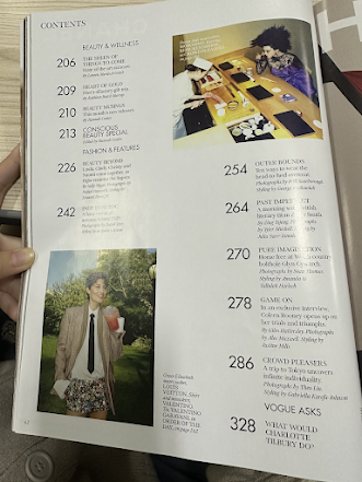
Here is a report of my weekly progress plan for my magazine project this will also include my rough planning for the project 

Reflection: Writing this weekly progress plan was very helpful as it helped me keep track of my progress during this project and if im confused on what tasks I have to complete I look back on this post in order to be organised and up to date. This also allowed me to reflect on the mistakes I did so far and making sure to not repeat the same mistakes again in the future. Even though it was hard for me to remember what I did clearly on each day I got help from friends and my teacher on what we did each day almost like a review each week. 

Week 

Term 2

Week 

Term 3

1

(2 Oct)

Brief, Research

8

( 8 Jan)

Development

2

Research

9

Shoot

3

Research

10

Shoot, Self Reflection

4

Proposal 

11

Post Production

5

Development

12

Post Production

6

Development

13

(12 Feb)

Deadline (Monday 12th February)

7

Development

14


Term 1 
Week 1 
I was absent for 2 days due to a family event and being sick, however I caught up with the info I received from the class in which they learned terminologies from Term 1 and just recapping all the material we learned so far, we also continued with more terminologies and theories, which included a new topic about narratives such as Binnary opposites, and the 5 media codes. Personally learning these new theories were quite difficult at first since the 5 media codes were hard to memorise but overtime as the class went on I understood more allowing me to memorise these theories better. However, we were supposed to bring our magazines to school but due to being sick I instead put all of my magazine research in my blog first (front page, contents, double pages) and bring it in our next lesson. Thus, I again caught up with my friends to know what we learned that day which was to analyze the front page and all of its elements, so I will review the material I missed by myself. 

Week 2 
We continued with the theories we learned in our last lesson but this time actually practice using them in a group work where we watched a clip from the new live action netflix show "one piece", and tried to identify different shots with all term 1 knowledge we learned but also adding theories to them in order to show how valid the shot were made in a specific clip as well as how it creates a message towards the audience. Another lesson was filled with a new topic which was representation theory from Staurt Hall and add that theory to our magazine . During our project day where we continued analysing our magazines and added more to our research blog, wee had to add more detail to the different magazines we had, from adding our dislikes and likes from the magazine in order for us to find out what we should and what we should not do in our magazine later on also including theories and the latest one we learned. Hence, why we had to add even more magazine research in our blog and even though this week involved a lot of brain storming and memorising as we needed to apply our theory on actually research writing I tried my best on figuring out a typical magazine convention and why my magazine follows the convention or subvert its. 

Week 3 
Decided to change the format of my weekly progress in order for it to be more reflective
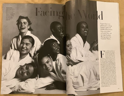
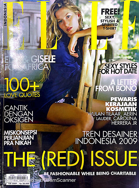
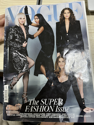
Class Lesson: We started our magazine research where we had to analyse 2 front cover magazines in detail as well as some less detailed analysis and made a review for our semestral exam about Stuart hall representation theory on our blog but before that we saw different videos of how oceans 11 and 8 has been represented differently. This was very helpful as it helped me define my target audience for my magazine more clearly
Tasks: Had to finish 2 big analysis and 4 small analysis on magazines as well finishing my statement of intent 
Problems: had to do a lot of writing and it was difficult for me to analyse each scene quickly and when i had to make my statement of intent as it took me a lot of time to figure out what needs to be added in my magazine and if its already a fixed idea or I can tackle and fix it in the future. 
Solution: Had to take time outside school and pay more attention to detail as I sometimes lack some point 
To Do List: finish magazine research and statement of intent 

Week 4 
Class Lesson: Started on magazine development and discussing genre theory by Steve Neale. This was also the week when we had to finish our magazine research 
Tasks: Magazine development such as finding mastheads, coverlines, and images related to my magazine genre  
Problems: I was actually sick the entire week and wasn't able to do these in class so I had to catch up and do it in my own spare time 
Solution: Asked help from my friends on how to find the best mastheads and coverlines and asked for their opinion if it works well on what i imagine my magazine to be. I also finished most of the tasks during my spare time which made me still on time in during this project.  
To Do List: 

Week 5 
Class Lesson: Started our double page spread research and how it looks before and after we finish reading the spread. We also added a terminology page on our blog and were told by our teacher to put our reflections on the very top of each posts as it will be easier for the examiner to identify even though this is mandatory 
Tasks: Do detailed double page research and adding reflections to the very top of our blog posts
Problems: I was absent during 2 lessons but joined 1 lesson from zoom due to still being sick which made me really behind on my magazine project which made me really concerned if I was able to finish everything before the due date. 
Solution: Caught up with friends and my teacher on what I missed and completed my double page spread research even though it was a bit late 
To Do List: Finish the double page research by next week 

Week 6 
Class Lesson: Learned about traditional and modern media and how much it has changed over the years and writing my first draft for my double page spread magazine article. Since this was a 700 word article my teacher helped us find references on what out article topic should be as well as figuring out what tone to use in our article in order for it to be engaging for my magazine target audience. 
Tasks: Start my first draft for my double page spread magazine article 
Problems: I wasted a lot of time on finding the topic for my article as I didn't know if it would be engaging enough for my target audience to read (teenagers) as I myself didn't read a lot of articles I wanted to make one that most teenagers can relate to easily and not easily just skip
Solution: My solution was to make an article about a interview/podcast about a celebrity in order for it to be relatable and still engaging for my target audience since there will be advice from the celebrity towards the audience reading the magazine
To Do List: Finishing my first draft for my double page spread magazine article by the next lesson or latest on Thursday's lesson 

Week 7 
Class Lesson: There wasn't anything new that we learnt as we did review for our semestral exams but this was also our last week before winter break
Tasks: Given a check list by our teacher in order for us to know if we completed everything needed in our magazine project 
Problems: Many blog posts to fully polish and complete on time as I didn't update this weekly progress plan due to being sick a lot during this term
Solution: Made sure to plan out which blog posts to finish in order for me to not be stressed out and cramming everything before the deadline which was on Thursday
To Do List: Complete everything on the checklist for my component one magazine project before Thursday and were told to take time to scout locations during our winter break 

Term 2 
This is the start of my term 2 which is why i will restart with week 1 in order for me to understand everythin
Week 1
Class Lesson: We got feedback for our magazine development as it was already marked and I just needed to add one more information as well as shortening my article, and changing the font and sizes of my header in order for it to be more readable. We also did our location scout and risk assessment for our front cover photoshoot. 
Tasks: The class began by completing a risk assessment for our location scout and immediately modifying the layout of our own blogs to comply with the examiner's request that each blog post have its own distinct thumbnail rather than being opened within the blog.
Problems: As I just started my risk assessment, it was hard for me to accurately find what could be the problem as its only in one location but just different parts of it 
Solution: Decided to ask from friends and my teacher what tragedies can happen within the location so I get outside output 
To Do List: complete my location risk assessment, as haven't finished the risk assessment for my first location and I still need to do 2 more.

Week 2 
Class Lesson: We learned about making our magazine layout and design from first hand drawn drafts all the way to digitalised drafts for how we want our magazine to look. There were many trial and error sessions as it doesn't seem that easy to come up with a finalised look as everything is intentional and has a purpose. This will also be the week where i have my scheduled photographs with my model and i will mostly take it on 27th Jan. 
Tasks: Creating a schedule for my photoshoots that will most likely be done all in one day 
Problems: The lighting for my first drafts were quite hideous and it was pretty hard to figure out how to edit it to my liking as I didn't have that much experience in editing 
Solution: Practice more on my editing skills and experiment more on editing in order to get used to it 
To Do List: Experimenting with more designs and layout to make it clearer on what typefaces, designs and layouts that I will use

Week 3 
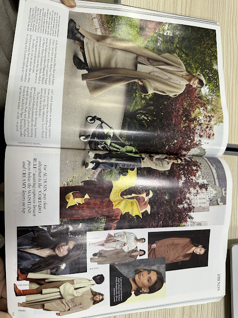
Class Lesson: We continued with our project lesson but now already started editing our drafts digitally and finalising them i personally liked using canva more which is why that was the website i used. However we had to make more development for our contents and double page spread as of now I mostly did practice for my front cover, but this was where i did more research on research for my mise en scene. 
Tasks: I had to finish the previous assignment for this week's assignments, upload it to a blog post, and then carry out the activity for the remaining pages (content and double-page spread). I also need to start getting ready for the photoshoot because I will be shooting my real photos soon.
Problems: As Im a very indecisive person this proved to be a set back as it took me a long time developing my sketches and digitalised covers 
Solution: Making the drafts as fast as I can so I have a lot of drafts to choose from this also allows me to not focus on detail and just getting everything done quickly 
To Do List: finish the front cover page assignment and go on to the remaining pages, beginning with the sketches.

Week 4 
Class Lesson: We started off the week with a theory lesson about answering past paper questions and finally started on our critical self reflection. We started out with a draft so that we have all our main ideas written out, and have a basic plan already set.
Tasks: My teacher recommended me to start my critical self reflection so that I don't have to pile up a lot of work in the long run
Problems: As of now Im having a difficult time managing my time as this week our classes were cut short due to a lot of holidays and events which is why I feel less motivated to do my work
Solution: Make a schedule of all the deadlines I need to accomplish in order for me to not loose track of time 
To Do List: Started designing everything visually and finalising what kinds of theme I will use 

Week 5 
Class lesson: Started by learning how to layout our magazine in order for it to look cohesive as well as front cover drafts for our final magazine 
Tasks: finish drafts and research for front cover development 
Problems: During that week we only had 2 media lessons as we had 3 days of holiday which cut our time in doing our project as I also had to do my test that I didn't do yet it also took 40 mins of project lesson which gave me more tasks in the long run
Solution: Doing my project more on the holiday doing it as homework in order to be more efficient 
To Do List: Having all my unfinished assignments as homework and trying to put together all the inputs and seeing if I should take in into consideration or not 

Week 6 
Class lesson: Did a final draft and work for our front cover as well as development and final drafts for both contents and double page spread. This is when I started to finalise everything to smaller details and its the week where I gain the most input from others for my work. 
Tasks: finish all the drafts and gain input for finalised work 
Problems: There was a local ceremony that cut out class time leaving me with lesser time to prepare for the deadline 
Solutions: Completing my work on my own schedule was the only way to get around this. I took a lot of time this week to finish the overall layout of my magazine so that I could get my teacher's input the following week. I also gained input from my upperclassmen on what I should add or remove. 
To Do List: Got remembered to do my critical self reflection and have it completed. As I have completed most of my drafts but I do need to work more on my development blogs. 

Week 7 
Class Lesson: FINAL WEEK BEFORE DEADLINE! All we did was finalise our magazines front cover, contents, and double page spread. This was also when I rushed to get everything done on time as I didn't use my time efficiently which is why I had so much to do from getting my teachers final input, finishing all the blogs, checking all the blogs, and making sure nothing is missing. This was also when I added my final 2 blog posts which was my final magazine and my embedded critical self reflection, I was actually done with my front cover and is just waiting for input but I am not fully prepared that I don't have much time for my development and critical self reflection as I wasn't done with most of it which scared me a lot. 
Tasks: Had so much to do this week from finalising my magazine, fixing up my blogs, and making sure all the content is there and nothing is missing, critical self reflection and having reflections for each blog post.
Problems: The biggest problem I encountered was collecting everything for my research and development pages as it took up a lot of space in my laptop and it took up majority of my time as I had to screenshot each change and put it on Canva so that I can put it on my blog post. 
Solutions: I ended up just screenshooting everything quickly and put everything in the file at the same time so that I don't waste my time 

Reflection: This weekly progress was actually something I hated doing cause it gets so boring and sometimes I even forget what I was doing in other lessons since we do something different at times. Which is why I only did a summary of everything in class and just expanded it at home, but again as time passes by its doesn't look as bad as it seems since I got to reflect a lot on myself through this. I was able to see what I improved or if I even improved anything at all this term but as I look at everything nothing really improved to be honest. But Im most happy about getting my designed fixed and seeing my final result as there were many skills I learned from using different softwares, apps, and websites which is why Im happy I get to experience doing everything I can for this project. Even though it has a hectic ending of me staying up each night getting it done, it was well worth the result as I feel satisfied enough to call this project done. 

Component 1: brief

Here is the brief for component 1 which I decided on a magazine 

Reflection: After hearing the brief I thought this project in general will be long and hard to accomplish as it consisted of 4 pages to be done just for the minimum (cover, content page, double paged spread). But as I saw the work of my upperclassmen and asked them myself about this project I felt inspired to do something even better and fun, I also got tips on how to do this project in order to achieve a good result.  

Final - Promotional Package

This blog consists of my groups final music video, digipak, and social media page. This blog is written by me (Rara)  Music Video MV Gdrive ...